Judith B. Ceramics
  • Judith B.
  • Gallery
  • Reveries
  • Influences
  • About
  • Contact

Arita's 400th Anniversary

10/11/2016

0 Comments

 
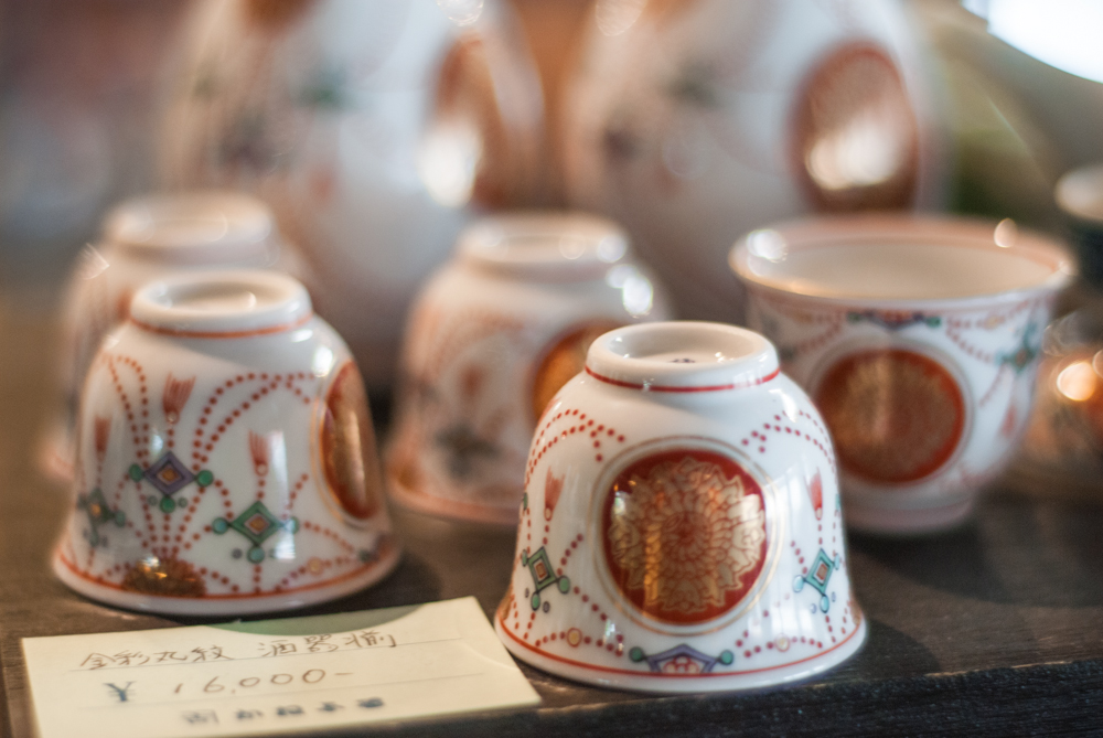
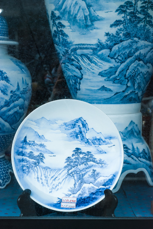
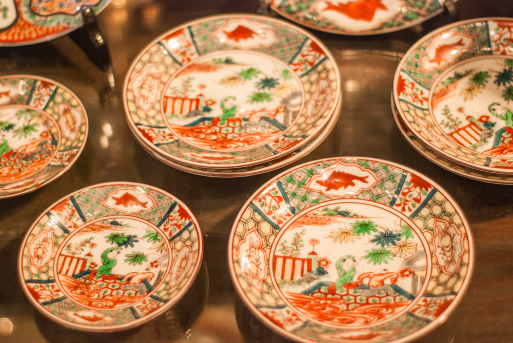
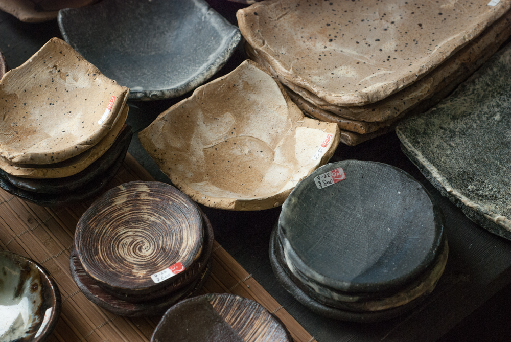
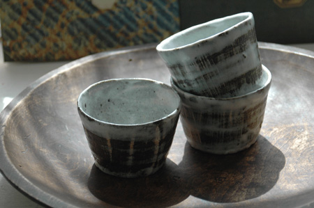
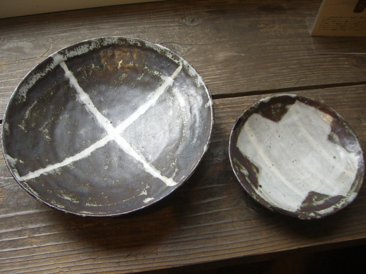
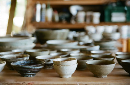
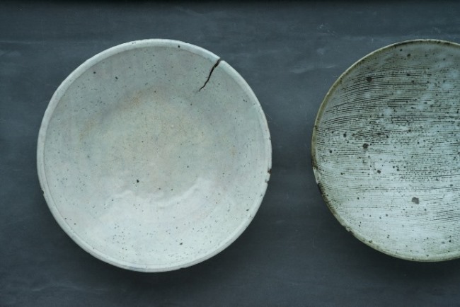
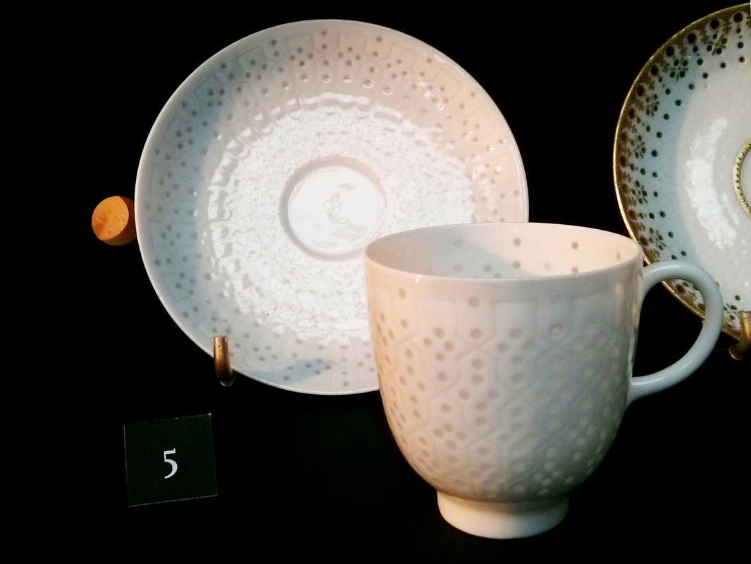
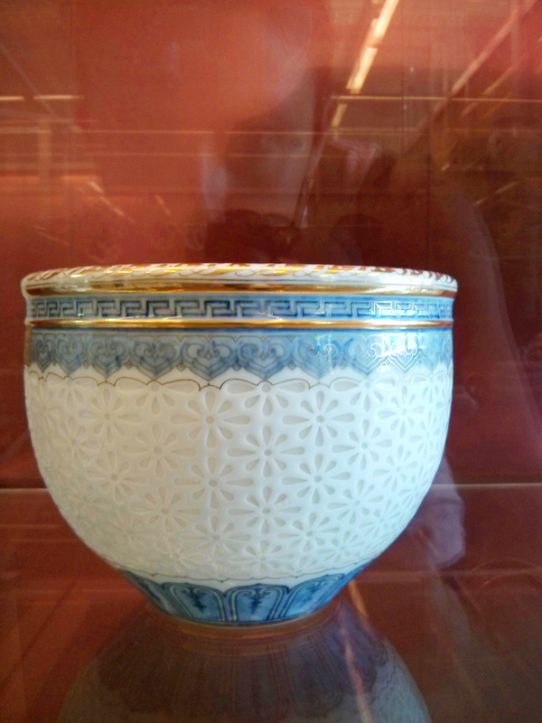
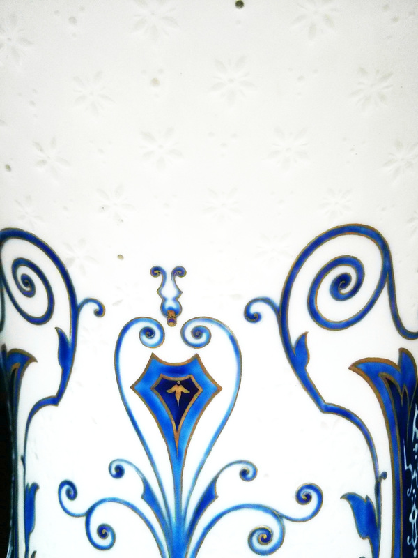
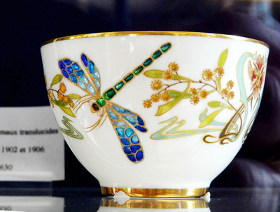
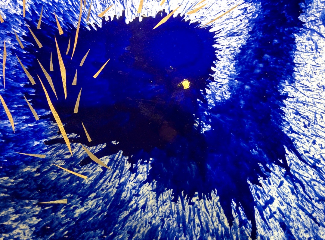
This year, Japan celebrates the 400th anniversary of Arita’s porcelain industry. Arita, located in Kyushu island is among the most famous pottery production centers in Japan.

Throughout the year, many events are organized to commemorate this special date.

Recently in Tokyo, two different exhibitions showcased Arita’s ware.
The first one, held in Isetan in Shinjuku, showed classical Arita ware. Antique and modern pieces were exhibited together. These were beautiful examples of the typically painted plates and cups, but also bolder and definitely more contemporary work such as Kashiwa Sato’s “Dissimilar” series, using the unmistakable blue pigments with gold accents. If you’re curious, most of the contemporary objects exhibited in Isetan can be found on the 400th anniversary’s website.

The second exhibition was held at Seibu in Shibuya and exhibited collaboration works between Arita’s manufacturing companies and international designers such as Scholten and Baijings, Stefan Diez and Kirstie Van Noort. You can find the full list on the official website.

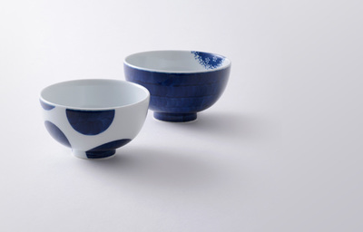
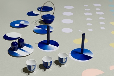
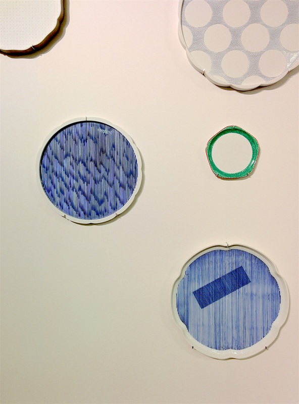
This collaboration resulted in the creation of the brand 2016/. There, the pieces were definitely contemporary with an obvious focus on forms and uses. As I was looking at these pieces I realized I could have never known these were made in Arita.
To me, this raises interesting questions: in Japan, Arita ware is easily identifiable because of its unique styles (you can read more about it in my previous blog post). But in collaborating with foreign designers, it becomes impossible to connect the finished product with the place of production. While there are obvious benefits in sharing the knowledge and skills, I wonder how Arita’s identity will evolve in the future.

In an effort to relaunch the production in Arita, which has struggled against foreign competition these past decades, Saga prefecture’s officials are earnestly promoting Arita ware internationally.  
This campaign, called “Episode 2” aims at shaping Arita’s future as a porcelain production center for the next 100 years:

This ambitious project “will focus on a variety of projects under 3 key concepts: innovation, branding and nurturing creators” .
Arita Episode 2 by Saga prefecture
If you want to learn more about what this Episode 2 is about, I highly recommend you visit the official website which lists all undergoing projects as well as a very interesting series of articles filed under “Topics”.
0 Comments

A trip to Kyushu part 2: Arita

14/6/2016

0 Comments

 
Karatsu and Arita aren’t even 40km away from one another but the pottery style they developed is completely different. Karatsu-yaki is characterized by earthy tones, rough textures or irregular shapes, but Arita-yaki is known for its finely painted porcelain.

Porcelain of fine quality was discovered by a Korean potter, Ri Sam Pei, about 400 years ago near Arita and ever since the production has thriven.

At the Kyushu ceramics museum, one can see the evolution of Arita ware from the 17th century. At first, the pieces were mostly white with fine blue decorations until Sakaida Kakiemon introduced other vivid colours. This is considered to be the beginning of Japanese style Arita ware. As Arita ware was favored by Europeans during the 17th and 18th century, the potters started adapting their style. Influenced by the European style and due to the important trade with the Dutch company, new glazes and decorations were introduced.

In Arita city, dozens of galleries are lined up along the main street. One can find all kinds of Arita-yaki there: the original Sometsuke style (blue underglaze on porcelain) but also the richer and more elaborate Iroe as well as Celadon ware .
Visiting the Kyushu Ceramics Museum is really interesting as we can see how little has changed in the past 4 centuries. The pieces on sale in galleries today are not very different from what was made in the 17th century.  At that time already, the pieces were thin, white and with delicate patterns with impressive regularity.
The Kyushu Ceramics Museum has also a very interesting timeline of the history of ceramics in Saga prefecture compared to pottery in China at the same time. The similarities in shape and styles are striking, with only a few years of difference between Japanese style and Chinese style.
For me, the most interesting section was the technical gallery with samples of clay raw, bisqued, glazed and fired to explain each decoration technique.

Aside galleries, it is possible to visit factories and see some of the traditional kilns in Arita. One of them is the Gen-Emon kiln. I didn't get a chance to visit it but it might be worth a detour if you're interested in the process of making ceramics.


0 Comments

A Trip to Kyushu Part 1: Karatsu

17/5/2016

0 Comments

 
When I talk to Japanese about pottery, they often ask me if I know about Arita-yaki. But not far from Arita in Saga prefecture, is also Karatsu. Even though these two cities are quite close (about 40kilometres), the pottery style is completely different.
Karatsu is a small city that used to be a very important port town for trading with China and Korea. Karatsu pottery first started under the influence of Korean potters in the 16th century.
There are a few different categories for each style, all of them quite irregular or imperfect. It is made with stoneware, decorated with glazes or sometimes with iron oxides. Each piece is very unique  and the textures are stunning. The freehand drawings are delicate and it seem like they dance on the pieces.
Even though Karatsu pottery declined after the Meiji era while porcelain was rising, it was revived by Nakazato Muan (12th Generation of the Nakazato family) in the 20th century. Now, there are about 70 working potters in Karatsu.

Wandering in the small streets of Karatsu, one can find many small galleries. While most of them have decently priced items, they also often have really pricey pieces. It was not unusual to see a tea bowl over 100,000¥ (about 900$). Karatsu pottery was prized by tea masters for the tea ceremony, which might explain why the prices go over the roof for some items. When it comes to tea ceremony, it is one of the most sought-after style. As the old saying says: "First Raku, second Hagi, third Karatsu."
The Nakazato Taroemon is one of the most notable galleries in Karatsu. This family has been making ceramics for 14 generations, which take us back to the 17th century. They produced ceramics mostly for the lords of Karatsu Castle who patronized the family. In the gallery in Karatsu, there are two exhibition rooms, one with work from the previous generations, the other one with newer work. The shapes are non-symmetrical and altered, which makes them really interesting to look at. The glazes have rich textures and colours. You can look at a piece from a thousand of different angles and always see something different. It is full of surprises, and feels like you could never get bored of using such pieces.

Not too far from this gallery is an old official kiln with 7 chambers, the Ochawangama. Even though it is now covered in grass we can still clearly see each chamber and the openings on the side.

There are many galleries and kilns to be visited around Karatsu and I recommend you get a map at the information centre if you decide to visit there. It is a great trip for anyone interested in tea ceremony, ceramics or wabi-sabi!

To learn more about Nakazato family, I recommend this detailed article by the Japan Times.

0 Comments

Experimenting with glazes: Bente Skjøttgaard

4/5/2016

0 Comments

 
Making ceramics is a difficult process. It takes years and a lot of failures to master this art. Still, even the most experienced potter will smash some pieces sometimes. Due to the many steps involved, making ceramics is a highly unpredictable art. In the kiln the temperature goes well over 1000°C, the clay and the glazes melt and bond in a unique way. This duality between mastery and uncertainty push some ceramists to explore and test boundaries.

Bente Skjøttgaard is one of them. Her pieces are inspired by nature (trees, clouds, etc), playing with void and empty spaces. However, what makes her work stand out is her unusual use of glazes.  

Looking at her pieces, I was fascinated by the variety of textures she created. Her glazes range from glossy to rough with everything in between. The glazes are applied in very thick layers and envelop the clay structure as if it was a living organism.  I was also surprised to discover that each piece is numbered and named as a "species", as if it was a taxonomy.
The dialogue between the different glazes and the raw clay sometimes still visible is stunning.
Even if there are some common shapes in her pieces, each one is very unique. We can feel that Bente Skj
øttgaard is always exploring.
“The basic elements in my work are the materials: clay and glaze. I enjoy engaging in expressive ceramic experiments that test the boundaries of material and form.”
Bente Skjøttgaard in Ceramics Now.
_Her pieces are now exhibited in prestigious museums throughout Europe and recognized as pieces of art, which is usually quite a challenge for ceramists who tend to be categorized as craftsmen and not artists. Bente Skjøttgaard succeeds remarkably in challenging this obsolete boundaries.

On that topic, I recommend this short video by Laura Morelli about the distinction between arts and crafts throughout history.
0 Comments

Teppei Ono at Cibone in Tokyo

4/11/2015

0 Comments

 
This weekend I went to Cibone in Tokyo where a few hundred piecec of ceramics by Teppei Ono are exhibited. Teppei Ono is a Japanese potter now living in Taniai (Gifu prefecture). Far from the city, he makes large plates, small cups, bowls, pitchers and so on.
At this exhibition, the pieces all had quite simple shapes. Some of them were combed which created a truly interesting texture. The white glaze was uneven on some of the pieces and I found these different densities quite beautiful.

Because all these ceramics were in the same tones, it gave a feeling of something still and quiet, yet very welcoming. The clay itself was gorgeous and felt wonderful. Teppei Ono says it is easier to convey his feeling if people touch his work, as holding a bowl in your hands is an experience anyone can have without being educated to pottery. Since Teppei belives his ceramics are almost a part of himself, coming out of his body, this importance of touch completely makes sense: he puts something very personal into his work and just looking at it is not enough to feel it.
The exhibition brochure features an interview of Teppei Ono in which he talks about his relation to his work. He notes how his hands changed since he started a while ago: “I use them a lot and they seem to be getting thicker. They’re becoming expressive, like a face”
“I use them a lot and they seem to be getting thicker. They’re becoming expressive, like a face”
Interview with Yoshitaka Haba
We usually think of the potter as someone shaping something, but I find it very interesting to see it the other way around: your body is also shaped by the work you’re doing. Which means it is a continuous exchange going both ways. As his body changes, his ways of making things will change as well.
But even though these ceramics are so unique and personal, they are really open, in terms of use. It is up to the user to decide if this bowl is going to be for drinking tea or eating rice. In the end, this is the kind of pottery we would pick in the cupboard because we like the feel of it.

The exhibition is open every day until November 17th, 2015 at Cibone in Tokyo. More information about the exhibition here.
0 Comments

Being a responsible designer

31/8/2015

0 Comments

 
Today, we are surrounded by so many objects, that more and more of us seem to have issues with hoarding: hunting for things, keeping them just in case, looking out for sales and bargains. But do we really need all these things lining up on the shelves of department stores? We all know how much waste is generated during the manufacturing process and the after-life of the product as well. Does it make any sense to design such objects, what difference do they make in our lives? As a designer your main goal might be to get a job and pay your bills, regardless of what you’re asked to create. That’s fair, but isn’t there an alternative?

Mike Monteiro, co-founder of Mule Design gave a talk in Lisbon (see video) in which he talks about the responsibility of being a designer and what could be the consequences if designers don’t stand up to what matters to them, to what matters to the rest of the world:
“And when designers disregard the effect that that manipulation [design] has on the environment, they are at best negligible; at worst, culpable. And when designers practice without forethought to consequences, without responsibility, what we get is not creation but destruction.”
Mike Monteiro
Several times in this video, he quotes Victor Papanek, a designer who strongly disapproved of unsafe or useless products. He wrote about his views on design in “Design For The Real World”, first written in 1971 but still accurate. Papanek asked designers to be fully responsible socially, and environmentally. For him, it is the designer’s job to tackle real issues such as better living or helping disabled people. It is up to the designer to decide not to create anything that he feels is unethical. Papanek was not delusional though, he knew very well that not every designer can afford to work on these social or ecological issues all the time, so he encouraged them to spend 10% of their time and resources to work on these problems. Yes, these issues won’t necessarily bring any money, which is why not everybody wants to spend some time working for undeveloped countries, or people living in remote areas without electricity. But it is our duty for the users and for the planet to choose which values to promote, which people to help. In doing nothing, we all contribute to a consumerist society that, as Mike Monteiro says, might bring destruction.
For makers and designers of any kind, I think it is a question we should all consider. Who are we designing for, and what is our goal? If we were to follow that 10% rule, we could change things, make a real difference.

I highly recommend you watch Mike Monteiro’s video “How Designers Destroyed the World”. Even though it's a bit long and he’s very blunt he made me realize that every choice we make when creating something has an impact; which is why we have to be extra careful. Victor Papanek’s book is also very interesting with lots of examples of things that were poorly designed, but also examples of projects focusing on important issues.

For a different point of view on consumerism, and on the subject of hoarding, I recommend reading “Stuff: Compulsive Hoarding And The Meaning Of Things” by Randy O. Frost and Gail Steketee. Through a few very interesting case studies, they try to explain what drives people to accumulate stuff.

Papanek, Victor. Design for the real world : human ecology and social change. London: Thames and Hudson, 1985. ISBN: 9780500273586
Frost, Randy O., and Gail Steketee. Stuff : compulsive hoarding and the meaning of things. Boston: Mariner Books Houghton Mifflin Harcourt, 2011. ISBN: 9780547422558
0 Comments

Bacteria and Design

21/8/2015

0 Comments

 
When two different fields meet, we can see the emergence of fascinating projects. Faber Futures is one of them. Natsai Audrey Chieza, based in London, is collaborating with professor John Ward from the University College of London to use pigments produced by bacteria.

In Fold, a silk scarf is folded into a petri dish where bacteria will leave and die over seven days. During this period, they will produce some pigments and imprint some patterns and colours onto the fabric.
The different colours and patterns are obtained with different kinds of bacteria, coming from the soil surrounding a plant’s roots.

In an interview she gave at the Science Library in Dublin, Natsai Audrey Chieza explains that this process could be transferred and adapted to mass manufacturing. With synthetic biology, it would be possible to program specific designs and colours, thus allowing the replication of a given pattern.
Bacteria are used a lot with foods, agriculture and drugs among other things. However, it is quite unusual to use them in such a creative project. The goal was to create a new aesthetic language where the laboratory protocol and the design process meet.

This field is called BioDesign, defined by William Myers as:

“BioDesign refers specifically to the incorporation of living organisms as essential components in design. […] BioDesign also highlights experiments replacing industrial or mechanical systems with a biological process”
William Meyers
This approach is becoming popular as we realize that the resources around us are not infinite and that we need to find new ways of producing and designing. In his book BioDesign: Nature + Science + Creativity, William Myers gives many examples in art, design, architecture or even advertising. A few pages of this book are available on his website.
This kind of projects are still highly experimental but they introduce new possibilities. If you are interested in that topic, I suggest this article by the NY Times: The Beauty of Bacteria.

Myers, William. Bio design : nature, science, creativity. New York: Museum of Modern Art Distributed in the United States and Canada by ARTBOOK/D.A.P, 2012. Print. ISBN: 9780870708442
0 Comments

Rice Grain Porcelain

17/7/2015

2 Comments

 
Recently, I visited both the Cité de la Céramique in Sèvres and the Musée Adrien Dubouche in Limoges, and I saw some absolutely beautiful ceramics. Both their collections have mainly very fine pieces, high quality objects made with the best skills available at the time. At both museums, I spend lots of time staring at porcelains made with the rice grain technique.

Even though it's called "rice grain", it seems that no rice grain was ever used for this technique. The piece is cut out and then all the holes are filled with glaze. After the firing, the patterns can be seen against the light as they are translucent whereas the body of the piece doesn't let the light go through.
This technique seems to be originally from Turkey but arrived in China around the 14th century. Later, it was also used in Europe as engineers and craftsmen were trying to create a porcelain as beautiful and white as the Chinese one. One of the most famous pieces exhibited at the Musée Adrien Dubouche is probably the full service made in 1878 for the World's Fair by the Manufacture Pouyat.
But the one that really caught my eyes was the Coupe Libellule by the same manufacture. Instead of filling the holes with translucent glaze, they used coloured glazes, and the result is absolutely stunning. The colours are unusually bright, due to the light filtering through them. Unfortunately, this was technically challenging and quite expensive so they stopped using that technique at the beginning of the 20th century.

Most of us are familiar with the white and blue bowls used in Asian restaurants, but this technique is still used by contemporary potters. The Finnish potter Eeva Jokinen is one of them: the rice grain technique allows her to play with light quite remarkably and the pieces she makes are beautiful. Chantal Lumineau is a French potter who also used this technique, but her work is more geometric as she cuts out triangles.

I searched quite a bit to see if anyone else ever used coloured glazes with the rice grain technique but so far, I didn't find anyone. If you know any potter doing this, please let me know!
2 Comments

Giving a Title to a Creation

2/6/2015

0 Comments

 
When it comes to pieces of Art, the question of the title is unavoidable. To artists, the title matters so much that even “Untitled” is a meaningful choice. Some galleries even organize "Untitled" exhibits. Titles are also quite important for museums and galleries when they need to print exhibition catalogs. But what about crafts people? Does it make any sense to give a title to something functional?
When I was still studying at university, I liked that the object was part of a whole. It had a shape and a function but it also had specific colours  and materials. Everything together would create a specific atmosphere, evoke something to the users. The title, the name given to this piece was also part of this whole. So would it mean that a piece without a title is somewhat incomplete? It sure is harder for other people to understand what they are looking at, or at least the intent of the designer.
People analyzing and creating the trends rely a lot on language (and colours and materials) because it gives a hint to the viewer as to what their intent is. Without the written or spoken worlds, the trends would be just an abstract collage of pictures but because they have a name that is carefully chosen, it becomes accessible to  more people. Language becomes a key for understanding.

There are different kind of titles. Some of them are purely descriptive, some of them refer to a process, some seem to have no link to the piece of art whatsoever. The latter ones are interesting since they add another dimension to the piece and the viewer will try to understand the link between that title and that artwork. In doing so, he will look more closely at the piece and probably access to a different level of understanding.
Sometimes also, titles are used to create a link between different pieces. By giving the same title to a collection, the artist creates a dialogue between things that would have been otherwise completely unrelated. It can be quite unsettling for a customer to see the same artist making very different things. Labelling the collection allows the artist to explore different styles but also ensure that the customer is not lost when looking at all the pieces.
Picture
Poster for the "Untitled" exhibition at the Singapore Art Museum in 2013 - 2014.
I highly recommend the really good article (in French) on that topic in Ateliers d’Art de France's magazine #117.
0 Comments

#CitizenOfCraft: Redefining The Meaning Of "Craft"

25/3/2015

0 Comments

 
On March 14, 2015, the Ontario Crafts Council launched an online campaign to gather people around the idea of locally made craft. Called Citizen Of Craft, this movement is defined by a 10 points manifesto that highlights the main characteristics of craft. At least four points out of ten are about the uniqueness of handcrafted objects compared to the standardization of mass produced objects. The other qualities listed on the manifesto are the value of traditional processes, the fact that hand crafted objects can also be contemporary, and most importantly the notion of community. Indeed, handmade objects connects the maker and its culture to the user.

The misuse of the term “craft” is what prompted the Canadian Craft Federation and Craft Ontario to design this movement. They felt that today, many things are said to be “crafted” even though they are mass-produced, making it harder to advertise authentic crafts and their singularities.

It is true that new technologies are available to industries, allowing them to produce more unique objects. This phenomenon called “mass-customization” allows customers to get affordable yet original objects or clothes. This topic was also discussed by Neil Gershenfeld in his book Fab.
In mastering these emerging means for personal fabrication, they're helping bring individual expression back into mass manufacturing
Fab, Neil Gershenfeld, p27
So what does it mean? If uniqueness is the main characteristic of crafts and if it is now possible to manufacture one of a kind objects, then where is the boundary between these two worlds? For now, the processes are still different and the quantities produced are incomparable. But with technologies such as 3D printing being used by both industries and individual makers, is becomes harder to make a clear distinction based on the techniques only.
To me, the main difference lies in the story behind the object. What does a mass-produced object tell-us? It is one among thousands and thousands and was probably made in Asia by underpaid workers using cheap materials. But a hand made object tells the story of a place, of carefully selected materials, of hours and hours of work, of someone who dedicated his life to create meaningful objects. And I believe we are more likely to feel a connection to an object so full of meaning. Why do we hold on to our grandmothers dishes, even though they are chipped? Because there is an emotional link, a background: it is not just an object but only a small part of a greater whole.

If you are a supporter of crafts, check out the Citizen Of Craft website and spread the word. The next phase will all allow people to connect with makers, associations and studios through an app. If you live in Canada, 2015 is also the Craft Year: the official website references all the exhibitions, workshops and conferences happening across Canada until December 2015.


And if you want to read more, I suggest reading this short text about whether mass-produced objects can be referred to as craft, and this article that questions the idea of the "Maker".

Gershenfeld, Neil A. Fab : the coming revolution on your desktop--from personal computers to personal fabrication. New York: Basic Books, 2005. ISBN: 9780465027453
0 Comments
<<Previous
Forward>>
All images on this website are the property of Judith Belin unless otherwise stated. © 2021
Instagram